Having clear and intuitive website navigation is crucial for website visitors to easily find the information they are looking for. A well-structured navigation system enhances user experience and increases the likelihood of visitors staying on your website longer. Here are some additional tips to make it easier for website visitors to find what they’re looking for:
How can we make it easier for website visitors to find what they’re looking for?
Limit the Number of Tabs
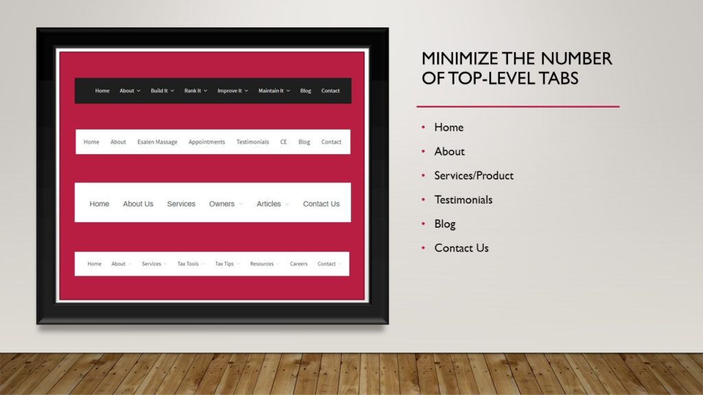
Minimize the number of top-level tabs in your navigation bar. Having too many options can overwhelm visitors and make it difficult for them to locate specific information. Focus on the most important and frequently accessed sections of your website, such as Home, About, Services or Products, Testimonials, Blog, and Contact.

Organize Subcategories
If you have a large amount of content or a variety of services, use dropdown menus or subcategories to organize related pages under the appropriate tab. This helps avoid cluttering the navigation bar and allows visitors to navigate to specific sections more efficiently.
Use Descriptive Labels
Ensure that the labels used for each navigation tab are clear, descriptive, and easily understood by visitors. Instead of generic terms, consider using specific labels that accurately represent the content or purpose of each section.
Prioritize User Experience:
Put yourself in the shoes of a first-time visitor and evaluate the navigation bar’s usability. Is there a clear path to the information they are seeking within a few seconds? Is the organization logical and intuitive? Make adjustments based on user feedback and behavior analysis to enhance the user experience.
Optimize for Mobile
With the rise in mobile device usage, it’s crucial to ensure that your navigation bar is mobile-friendly and responsive. Test its functionality and appearance on various screen sizes to ensure smooth navigation for mobile visitors.
Make your contact information easy to find
It’s important to have a clear way for people to get in contact with you. Include your contact page as the last item in the navigation.
Using resource pages
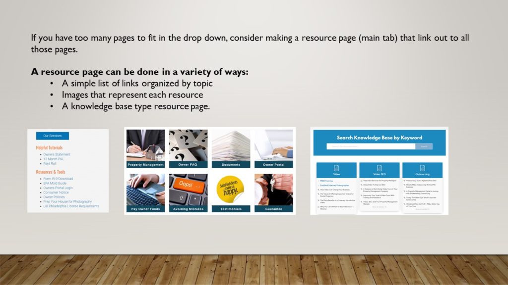
If you have a lot of content on your website, using resource pages that link out to your important content might be a solution that works for you. That is a better choice than cramming in too many pages in a drop down menu.

Regularly Review and Refine Your Navigation Menu
Continuously monitor and analyze user behavior to identify any navigation issues or areas for improvement. Regularly review your navigation bar’s performance and make necessary adjustments to enhance usability.
- Is there a clear path to the information they are looking for? You want to get them to the information they seek in 2-3 seconds or they will leave.
- If you have several types of visitors, is there a clear path for each type?
- How are your top level tabs? Are they organized in a logical way based on what you are offering?
- Do you have 10 pages in your drop down? Could you instead offer a resource page and link to them from there?
- Do you have a clear way for them to contact you (via email, phone or form)?
By focusing on these principles, you can create a clear and user-friendly website navigation bar that enables visitors to find the information they need efficiently, improving their overall experience on your website.
