Do you have clear Call to Actions on your website? What is the goal of your website, and how are you directing visitors to this goal? Let’s discuss how you can improve your website’s Call to Actions (CTAs) to effectively guide your visitors towards the desired actions.
Purpose of a CTA (Call to Action)
A CTA encourages your website visitors to take a specific action. That might be anything from buying a product to filling out a form to request some information. CTAs are crucial for converting visitors into customers or leads.
Your CTA should:
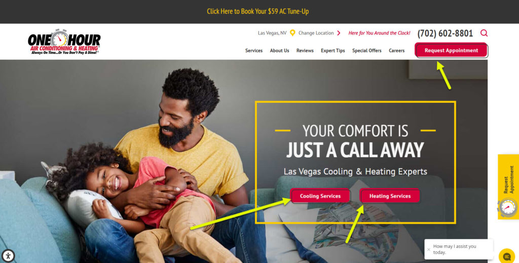
- Grab attention: Use eye-catching design elements such as contrasting colors, bold fonts, or compelling visuals to make your CTA stand out on the page.
- Clearly communicate the value proposition: Tell the user what they will get when they click the button. Use persuasive language that highlights the benefits or rewards they will receive by taking the desired action.
- Guide the user to the next step: Your CTA should lead visitors to the next step in the sales funnel or customer journey. Whether it’s making a purchase, signing up for a newsletter, or downloading an ebook, ensure that the CTA aligns with your overall business goals.
CTA color
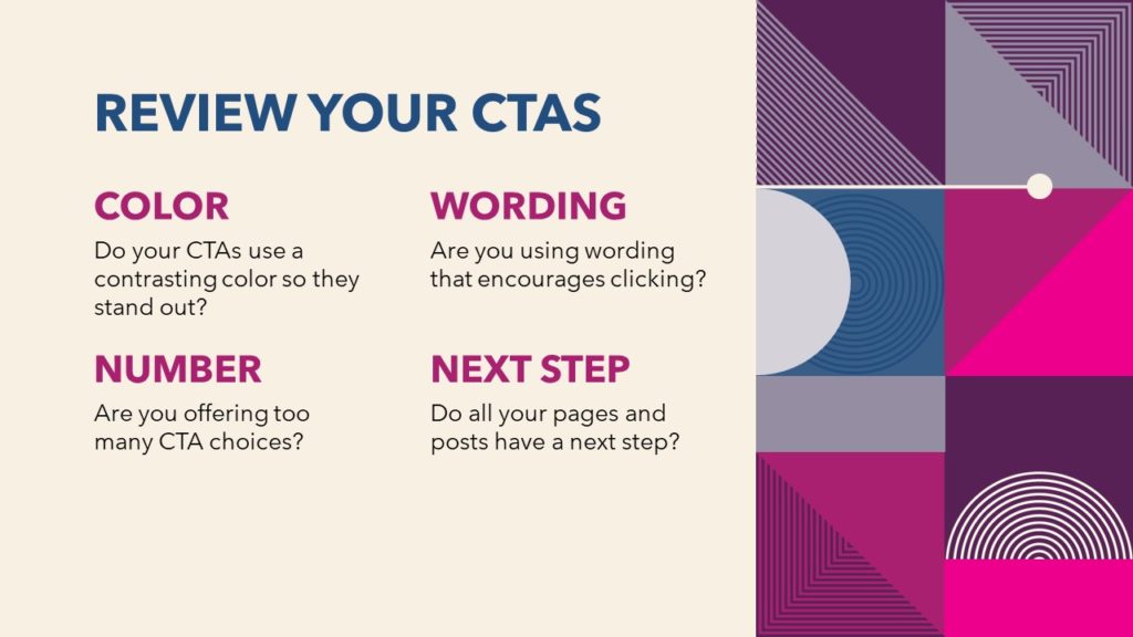
 While there is no “best” color to use for CTAs, using consistent colors with your CTA buttons can help create a visual identity for your brand. Consider the following tips when choosing colors:
- Contrast: You don’t want your CTA to blend in with your site’s color palette. Use a contrasting color to help it stand out on the page and grab attention. For example, if your color palette is shades of blue, try using green, yellow, or orange for your CTAs.
- Consistency: Be consistent and use the same color for all your CTAs. This helps to clearly identify opportunities to click on the page and reinforces your brand’s visual identity.
Using wording to encourage clicks
The wording you use in your CTAs plays a crucial role in encouraging visitors to take action. Tailor your CTA copy to suit the specific action you want visitors to take, and make sure it conveys the value or benefit they will receive by clicking.
Here are some examples of effective CTA copy:
- Get my FREE ebook now
- Sign up for the course
- Subscribe to my newsletter
- Start your Free Trial
- Learn More about my consulting services
- Get Started today
- Join Now
- Book an Appointment
- Buy Now
- Share on Social Media
- Request a FREE ebook
- Download Your eBook Now
How many CTAs should I use on a page?
The number of CTAs you should use on a page depends on the purpose of the page and your goal. Here are some guidelines to consider:
- One clear CTA
There are situations when focusing on one CTA is best. For example, if you have a page describing the benefits of a product, you probably only want to offer a BUY NOW button on the page. You are convincing them to purchase the product, and you want their next step to be buying it. You can place your CTA button in several places on the page, but you are still offering one “next step” option. - Multiple CTAs
Sometimes you need to give visitors a few choices. However, try not to offer more than 2 or 3 choices. You may have several CTAs because you have several types of visitors on your site or people at different stages of the buying cycle. Some might be ready to buy, and some might need more information. In such cases, make sure the CTAs are clearly differentiated based on the visitor’s needs and stage in the buying process.
What is your Next Step? Where do you want visitors to go?
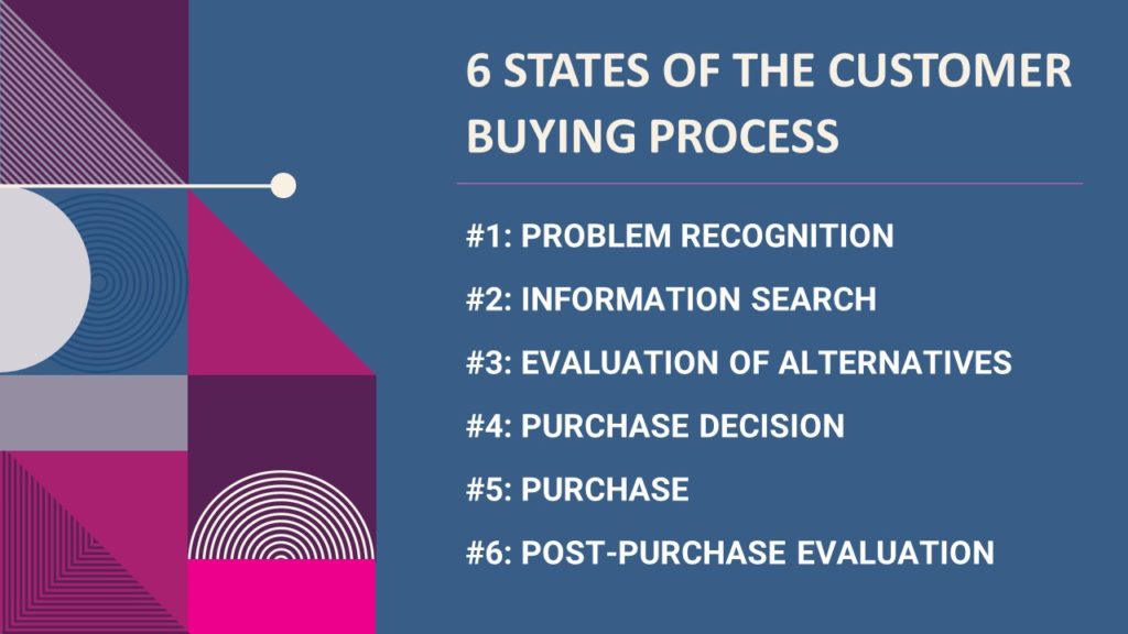 Consider the 6 stages of the buying process when deciding what type of CTAs to include on a page. Your website should guide visitors through a logical path of pages that end with your goal. Here are the 6 stages of the buying process:
- Awareness: The visitor becomes aware of a problem or need.
- Research: The visitor gathers information and explores available options.
- Consideration: The visitor evaluates different solutions or products.
- Decision: The visitor is ready to make a purchase decision.
- Purchase: The visitor completes the purchase process.
- Post-Purchase: The visitor engages with your product or service after the purchase.
For pages providing detailed information on your product or service (steps #2-#4), your next step may be to send them to a purchase page or a place to schedule a service. Aligning your CTAs with the appropriate stage of the buying process ensures a smooth customer journey.
Button vs Link CTAs
While internal links are important for SEO and navigation purposes, your main CTA should be a button that stands out. Here’s why:
- Buttons stand out better: Buttons with clear labels and design elements attract attention and are more likely to be clicked.
- Differentiate the main CTA: By using buttons for your primary CTAs, you can visually distinguish them from other internal links on the page. This helps guide visitors toward the desired action.
Things to check with your website Call to Actions
- Analyze your website’s CTAs: Ensure that you have a CTA option for each type of visitor on your site, catering to their specific needs and interests.
- Use a contrasting color: Make sure your CTAs stand out by using contrasting colors that catch the eye.
- Use persuasive wording: Craft compelling copy that encourages users to click the button and clearly conveys the value they will receive.
- Determine the right number of CTAs: Avoid overwhelming visitors with too many choices. Strike a balance by providing a sufficient number of CTAs without causing confusion.
- Lead visitors to your goal: Ensure that your CTAs guide visitors to the “next step” that aligns with your business goals and the stage of the buying process they are in.
By following these tips and conducting regular assessments of your CTAs, you can optimize their effectiveness in driving user engagement and achieving your website’s objectives. Remember to always analyze the results and test different variations to continuously improve the performance of your CTAs.